Getting travelers to your campground’s website is only half the battle. Once they arrive, you need to convert that interest into a confirmed reservation. The booking experience you provide — how easy it is to find available dates, understand site options, and complete payment — has a direct and measurable impact on your occupancy rate.
Most campground websites leave significant revenue on the table by making the booking process harder than it needs to be. Here’s what the best-performing booking pages do differently.
Load Time Is a Booking Killer
Before worrying about design or content, address performance. A booking page that takes more than three seconds to load loses a substantial portion of mobile visitors before they ever see your availability calendar. Compress images, avoid embedding oversized videos on the booking page, and check that your booking widget loads asynchronously so it doesn’t block the rest of the page.
Test your booking page on a mobile device using a cellular connection — not your office WiFi — to see what guests actually experience.
Lead With a Clear Value Proposition
Your booking page header should answer three questions immediately: What kind of experience do you offer? Where are you located? Why should I choose you? A line of copy that reads “Full-hookup RV sites and shaded tent camping 20 minutes from Glacier National Park” tells a prospective guest everything they need to know to decide they’re in the right place.
Don’t bury this in a long page that requires scrolling. State it clearly at the top, alongside a strong hero image.
Make the Availability Calendar Obvious
The single most common mistake campground websites make is hiding the booking widget. If visitors have to hunt for the “Check Availability” button, you’ve lost the booking moment.
The availability calendar or date picker should be prominent on the page — ideally visible without scrolling on both desktop and mobile. Consider placing it above the fold with a simple two-date entry (arrival and departure) that triggers a search.
Display Site Options Clearly
Once a guest has selected dates, they need to understand their site options at a glance. Each site type should have:
- A clear name and category (pull-through 50-amp full hookup, tent-only walk-in, etc.)
- Price per night
- Key amenities listed concisely
- At least one photo showing what the site actually looks like
Avoid listing sites by internal numbering alone (Site 14A, Site 22B). Group and label by type. Guests shouldn’t need to memorize your site map to make a selection.
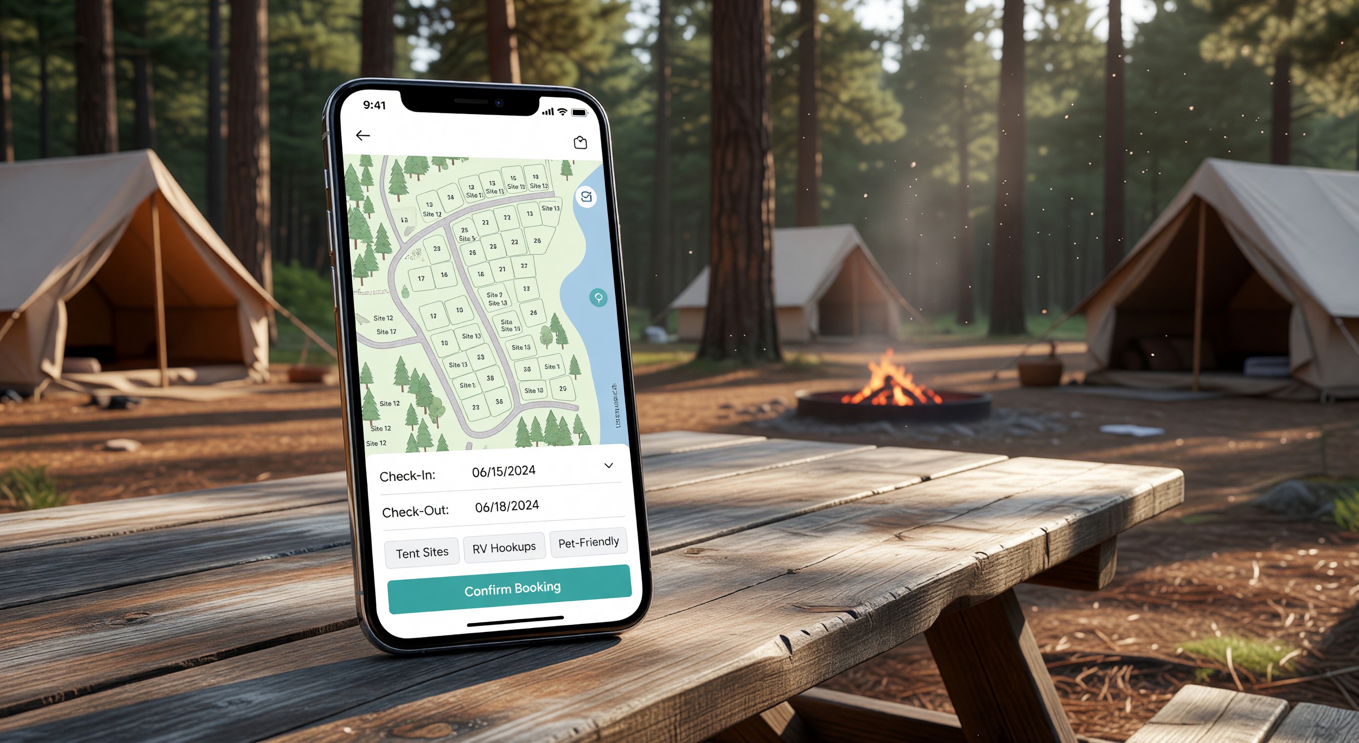
Show an Interactive Site Map
For parks with 50 or more sites, an interactive map is a strong conversion tool. Guests can see where their site is relative to bathhouses, playgrounds, the entrance, and roads. They can visualize the shade situation, the distance from noisy areas, and proximity to facilities they care about.
Several reservation platforms include interactive map builders as a standard feature. If yours doesn’t, consider whether a static PDF map would at least give guests spatial context.
Minimize Form Fields at Checkout
The checkout form should ask for only what you genuinely need to process the reservation and communicate with the guest: name, email, phone, payment details. Every additional field you add reduces completion rates.
If you have a pet policy, ask about pets. If you need a vehicle type for site assignment, ask. But don’t collect marketing survey responses at checkout — that’s what confirmation email follow-ups are for.
Build Trust with Social Proof
Campground travelers rely heavily on peer reviews. Displaying a selection of recent positive reviews on your booking page — pulled from Google, TripAdvisor, or your own platform — builds confidence at the moment of decision.
A simple star rating (4.7 out of 5, 312 reviews) prominently displayed near the booking widget is often more persuasive than any marketing copy you can write.
Clearly State Your Cancellation Policy
Ambiguity about cancellation is one of the most common reasons travelers abandon a booking mid-process. State your policy plainly on the booking page, before guests enter payment information. “Full refund 14+ days before arrival, 50% refund 7–13 days, no refund within 7 days” is clear. “See terms and conditions” is not.
Optimize for Mobile
More than half of leisure travel searches now happen on smartphones. Your booking page must be fully functional on mobile — not just “mobile-friendly” in the sense that it technically loads, but genuinely easy to use on a small touchscreen.
Test the complete booking flow on iOS and Android: date selection, site browsing, checkout, and confirmation. Fix any tap targets that are too small, any form fields that don’t trigger the right keyboard, and any checkout steps that are confusing on a small screen.
Frequently Asked Questions
Should I require account creation to complete a booking? No. Requiring guests to create an account before booking is one of the highest-friction obstacles you can introduce. Offer account creation as an option — it’s useful for returning guests who want to see their history — but always allow guest checkout without registration.
How many photos should I include on my booking page? Aim for at least three to five photos per site type, plus general property photos showing the overall atmosphere. Quality matters more than quantity — one clear, well-lit photo of an actual site is more persuasive than ten blurry snapshots.
Can I add upsells during the booking process? Yes, and this is worth doing thoughtfully. Offering firewood bundles, golf cart rentals, or activity passes during checkout is a reasonable upsell that many guests appreciate. Keep it to one optional upsell step — don’t turn checkout into a gauntlet of add-on offers.
Does it help to show pricing for different dates to encourage flexible booking? Absolutely. A simple calendar view showing rate variations by date lets price-sensitive guests find their best window. Some guests will book an off-peak date they wouldn’t have considered otherwise, which is a win for both occupancy and revenue spread.
Further Reading from Authoritative Sources
- ARVC campground digital marketing and online booking standards — ARVC provides digital marketing and online booking guidance for campground operators, making it the most relevant trade authority for conversion optimization recommendations in the campground market context.
- Conversion rate optimization principles and booking page best practices — Wikipedia’s conversion rate optimization article provides authoritative background on the UX and pricing transparency principles that drive booking completion rates, supporting campground operators who need foundational CRO concepts before applying them to their booking page.